We are at the stage of the build where we now need to start finalising our preliminary selections in regard to colour. With any build some of these colours may be influenced by environmental considerations (dark colours absorb more heat than light colours for instance), local context relationships, client preference/ tastes and in some cases heritage.
In our case we have no real restrictions on what we have selected apart from our environmental compliance requirements for roof sheeting. So, how do we establish a successful colour scheme. Lets confine ourselves for the purpose of this blog to external colours.
Our approach, call it a practice philosophy, is generally to select a ‘natural palette’ of materials. This allows the scheme to not necessary rely on applied finishes but formulate its colour from the material themselves. This also allows for user integration over time of ‘coloured elements’, planting, sculptures, lighting, whatever they may be to more easily integrate with a muted natural base building palette.
One thing that often also gets overlooked, or not understood until the project is complete, is the effect of texture and finish of the colours proposed. As an example, on this project we have a highly textured feature patterned brick wall to the street with screen elements and projecting brick elements. Depending on the time of day and path of the sun this wall will vary in its colour presentation because of the impact of shadow that this texture will produce. In other words, one brick colour will achieve several different shades over the course of the day. This would happen naturally of course, but adding texture will enhance the range of colours and colour mix of the project.
This weeks tip. When choosing your paint colours, don’t just rely on the sample at the paint suppliers showroom. Grab a sample pot and paint it on the wall at the project site. We will often also select shades either side of the colour we are thinking and paint them on the wall too. It is amazing how much the influence of light and orientation can affect a colour proposed.
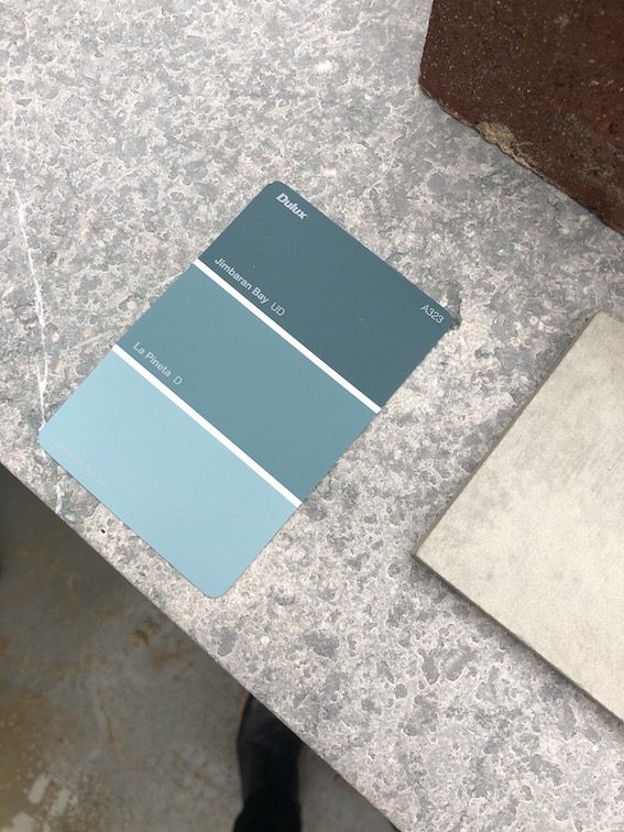
Colours and textures currently proposed in this weeks image. Enjoy your weekend :)
 Facebook
  Houzz
Houzz  Linkedin