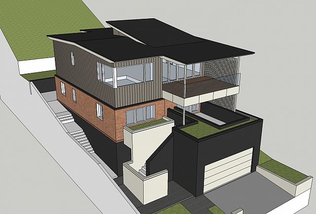
Early studies for external colour selections at Queenscliff. I’ve always been conscious on this one about how we manage the bulk of the building at the street front. This is due to the fact that the majority of the view toward the building will be accentuated because of the topography. We are always looking at this building from below.
I like to refer to it as a ‘wall building’. This means not a lot of the roof form and volume will be seen. This requires us to concentrate on how we manage the scale and proportion of the walls and avoid the roof looking like a ‘thin lid’.
We have chosen to divide the elevation through material use, and break up the heavier masonry elements through the use of colour. In terms of the roof we will introduce some texture to the ceiling, accentuate our overhangs and oversize the gutters and downpipes to provide detail and relief.
Next step is to present this strategy to the client :).
 Facebook
  Houzz
Houzz  Linkedin